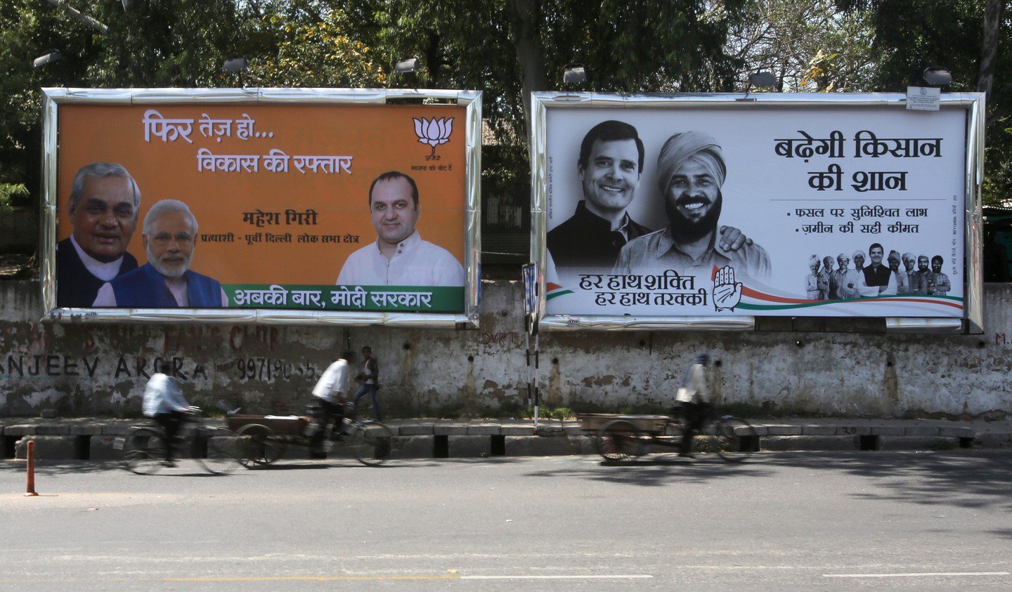
If you’ve ever waited at a traffic light in Connaught Place or crawled along Bangalore’s Outer Ring Road, you already know how hoardings fight for your attention. You’re sitting there, half-annoyed by the jam, maybe sipping tea from a flask or fiddling with your phone, and then something above the crowd of cars yells at you—not with words, but with color.
That’s how fast color works. You don’t read a headline first; you don’t even register the brand name immediately. It’s the shade, the brightness, the contrast. Your brain processes that before anything else. And once it has your attention, then you decide whether you’ll bother reading the line or recognizing the logo.
Outdoor advertising thrives on this. It’s not like Instagram, where you can stop scrolling and zoom in. On the street, brands have one shot, two seconds maybe. If the color doesn’t grab you, the whole ad might as well not exist.
Why Red Eats First
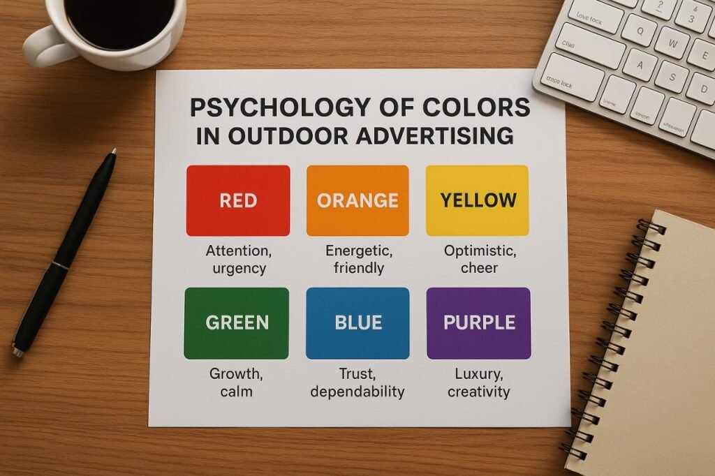
Let’s start with red. The color you can’t ignore even if you want to. Think Zomato’s massive hoardings—plain red backgrounds with bold text that almost taunt you. They don’t even need to show food; the red itself makes your stomach growl a little.
Coca-Cola built an empire on red. Indian weddings, sindoor, even the little red chili in your kitchen—our culture already links red with energy and appetite. That’s why on a dusty Delhi flyover, a red hoarding slaps you awake.
But red is tricky. If every hoarding screamed in red, you’d tune it out. That’s the paradox: the loudest color also burns out fastest. Smart brands know to let red work like chili powder—use too much, and nobody enjoys the dish.
Blue: The Opposite of Panic
Now picture this. After three red hoardings in a row, you suddenly see a deep blue billboard from SBI. Feels calmer, doesn’t it? Blue doesn’t yell. It breathes.
There’s a reason why tech companies (Samsung, HP, IBM) and banks (almost all of them) love blue. It whispers trust. It tells you, “Relax, we’ll take care of it.” On a chaotic highway, that reassurance is golden.
Jio, for instance, plays with both red and blue. Red for urgency—offers, speed, the rush. Blue for dependability—the network that won’t fail. The balance is no accident; it’s psychology in design.
Yellow: The Instant Eye-Catcher
Yellow is interesting. It’s not loud like red, but it’s impossible to miss. Traffic signs use it for the same reason: the eye spots yellow faster than most colors.
McDonald’s figured this out decades ago. Those golden arches can stand against any skyline, day or night. Subway also uses yellow to appear friendly and energetic. In India, Flipkart floods hoardings with yellow during “Big Billion Days.” Even if you’re not planning to shop, the color nags you until you at least check.
The danger? Too much yellow feels harsh. That’s why designers rarely use it solo—they pair it with black or green for balance. A giant all-yellow hoarding might dazzle for a second, then feel like sunlight stabbing your eyes.
Green: The Comfort Zone
Green is the color you don’t notice until you need it. Amul slaps green backdrops when selling freshness. Starbucks built an entire identity on it—eco, friendly, sustainable.
In India, green also carries cultural weight. It feels rooted, people-friendly, safe. Political hoardings often use it when they want to look close to the ground, connected to common people. A green billboard on a long highway doesn’t annoy you. It almost feels like scenery.
And that’s its strength. Green doesn’t fight for attention, but it earns trust quietly.
Black and White: The Bold Silence
Here’s where it gets really interesting. Not all effective hoardings are colorful. Sometimes, stripping color away does more.
Apple is the classic case. A pitch-black background, a glowing iPhone, maybe a single line: “Shot on iPhone.” On a street full of garish reds and yellows, that minimalism feels like confidence. Luxury brands—Gucci, Chanel—do the same. They know their audience will spot them without noise.
Black-and-white outdoor ads are like a calm person in a shouting match. Everyone turns to look.
Orange and Purple: The Outsiders
Orange doesn’t get enough credit. It’s playful without being reckless. Think of Fanta—it’s literally bottled sunshine. Nickelodeon too, bright orange splashes that scream fun for kids.
Purple is even rarer. But precisely because it’s rare, it works. Cadbury turned purple into shorthand for indulgence. A deep purple hoarding on a crowded Indian highway feels royal, even if it’s just selling a chocolate bar.
In outdoor advertising, sometimes being unusual is the win. Purple does that better than almost any other color.
Contrast is the Real Secret
A fact outdoor designers quietly live by: it’s not just the color itself, but what you pair it with.
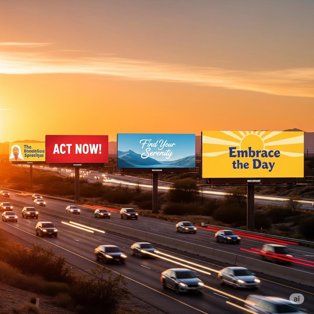
Yellow on white? Invisible. Yellow on black? Striking. Red on blue? Messy. Red on white? Sharp.
Because let’s be honest—you’re not staring straight at a hoarding. You’re glancing at it while overtaking a bus or waiting at a signal. If the colors don’t punch through the background immediately, they’re wasted. That’s why high-contrast combinations rule the roads.
Context Matters More Than Designers Admit
Here’s something many people overlook: colors don’t mean the same everywhere. In India, red is auspicious. In the West, it can mean danger. Green can be religious here, but neutral elsewhere.
That’s why big brands adjust. During Independence Day week, hoardings in Delhi suddenly bloom in saffron, white, and green. It’s patriotic, but it’s also strategy—brands piggybacking on shared emotion.
Even seasons play a role. Summer campaigns often go warm—yellows, oranges. Winter hoardings lean cool—blues, silvers. Festive season? Expect gold and red. Color choices mirror mood as much as message.
Why It Matters More Outdoors
Online, you can pause, zoom, scroll back. On a street, you can’t. Billboards don’t get second chances. The first glance decides everything.
That’s why color is not decoration—it’s survival. If your hoarding doesn’t hook in two seconds flat, you’ve lost the game. Clever copy, witty lines—they all come later. First, it’s color. Always color.
A Small Experiment
Next time you’re at a red light, try this: don’t check your phone. Just look up. Notice which hoarding you see first. Was it the witty headline? Probably not. More likely it was the color screaming across the flyover.
Red made you crave. Blue made you trust. Yellow made you grin. Black made you curious. That’s how the brain works—color before words.
Closing Thought
Outdoor advertising is a battlefield of seconds. Colors are the frontline soldiers. The smartest brands know how to pick them, balance them, and sometimes even avoid them. Because in the chaos of traffic, it’s not the message that speaks first—it’s the mood a color sets.
And once you feel something, even for a split second, you’re already halfway sold.