Stand on any busy road for just five minutes, and you’ll see how little time a hoarding really has. Cars zip past, bikers weave through traffic, buses block half the view, and pedestrians barely look up. In that chaos, only the boldest designs—and yes, the cleverest phone ads—manage to grab attention.
Over the years, brands have learned a tough lesson: a hoarding isn’t about explaining everything. It’s about creating one strong visual hit that people notice even from 100 feet away. Especially when it comes to phones, where the market is so crowded, the design has to speak louder than words.
Why Phone Brands Love Hoardings
Phones are not small purchases; they’re statements. People want to feel like they’re buying into something stylish, modern, and aspirational. That’s why mobile brands—from Apple to Samsung to OnePlus—spend heavily on outdoor advertising.
A single large hoarding on a prime road says, “This is the phone everyone is talking about.” It’s not just about specs. It’s about presence. If you see the same sleek design at every signal, it starts to stick in your mind.
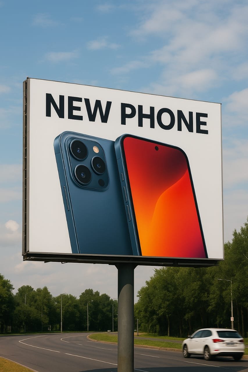
Design That Works From a Distance
The biggest mistake many brands make is trying to cram too much into one hoarding—multiple features, too many taglines, and crowded visuals. The truth is, the human eye can only catch one thing in a quick glance.
Good phone hoardings follow three rules:
- Big, Clean Visual of the Phone – The device itself is usually the hero. Sleek, shiny, enlarged to a size where it feels aspirational.
- One Strong Highlight—Maybe it’s the camera. Maybe it’s the battery. Maybe it’s just the design. But only one, never three or four.
- Minimal Words – Think about Apple’s billboards. Sometimes, it’s just a picture taken with an iPhone and the words: Shot on iPhone. That’s it. Yet, from far away, it’s powerful.
Playing With Scale
Some of the most attention-grabbing hoardings for phones use scale. Imagine a 30-foot-tall phone image dominating a city skyline. The exaggeration itself makes you look twice.
Samsung once placed a giant mock-up of its Galaxy phone on the side of a building in Chicago. At night, the screen lit up like a real phone. Passersby couldn’t ignore it.
In India too, when Vivo or Oppo launch a new model, they often take over multiple boards across one stretch of road—so the same design repeats in your eyes again and again. That repetition plus scale builds memory.
The Power of Color
Colors matter more than people think. A red hoarding in a sea of dull greys can’t be missed. That’s why brands often choose bold, contrasting backgrounds—deep blue for Samsung, striking red for OnePlus, or clean white for Apple.
Even from far away, the right color makes the hoarding pop out of the urban mess of wires, trees, and other boards.
Motion and Light
These days, some phone brands are moving beyond static flex. Digital hoardings with LED lighting or motion effects create drama, especially at night. Imagine a phone image where the camera light actually blinks, or the screen glows—small touches that make a hoarding feel alive.
In places like Times Square, phone ads don’t just sit still—they move, rotate, or extend into 3D. That’s storytelling with design, not just a flat display.
Local Flavor Works Too
Not all attention-catching designs need global polish. Sometimes, adding a bit of local context makes the hoarding instantly relatable. For example, a phone ad near a metro station could show people taking selfies inside a crowded coach with the tagline: “Clear shots, even when life isn’t.”
That kind of storytelling doesn’t just catch the eye—it sticks in memory.
Less Is Always More
If there’s one golden rule for phone hoardings, it’s this: simplicity wins.
Apple has shown this for years. A single image. A single line. A single thought. That’s enough to make a phone feel iconic. The more you clutter, the more you lose.
Final Thought
Designs that catch attention from a distance are not accidents. They’re the result of clear thinking: what do we want people to notice in two seconds flat? For phones, that usually means showcasing design, camera, or lifestyle in the cleanest way possible.
In a crowded cityscape, the hoarding that works is not the one shouting the loudest—it’s the one telling its story the simplest. And when a sleek phone ad nails that, you don’t just see it from a distance—you remember it long after you’ve driven past.